You’ve got 20 minutes to spare, but the city feels endless. You step out of the station and realize you don’t know which way to go. A transit map would’ve saved you, yet you left it behind.
Transit maps look simple, but that’s the point. They’re designed to help you move between stops, not to confuse you with street details. If you can read a colored line and spot the right stop, you can get where you need to go.
In this guide, you’ll learn what transit maps show, why they don’t look like real neighborhoods, and how to read them step by step. You’ll also see examples from New York, London, and Tokyo, plus beginner tips to avoid common mix-ups.
Why Transit Maps Ignore Real Streets and Shapes
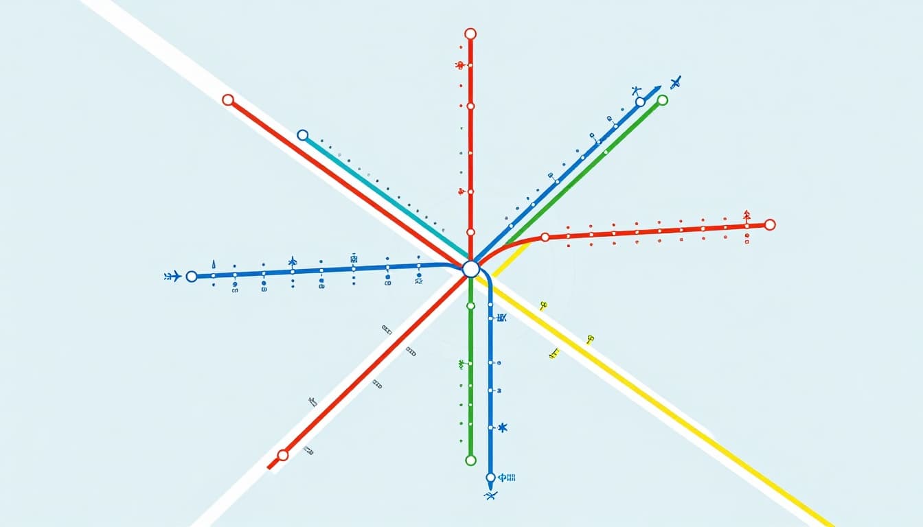
Most transit maps do not try to match the real world. Streets don’t line up. Curves get straightened. Distances shrink and stretch.
That’s not a mistake. It’s a design choice, because riders need a clear path, not a perfect picture. A transit map acts more like a route diagram than a street map.
On many systems, you’ll see routes drawn as straight, colored lines. Stops appear as dots. Interchanges show up as special markers. When lines cross, the map signals a possible transfer, even if the tracks curve underground in real life.
So why do cities use this style? Because it reduces mental load. When you’re tired, late, or unfamiliar with the language, you don’t want to also do math. Instead, you want quick answers:
- Which line should I take?
- Where do I switch?
- What stop do I get off at?
This approach has deep roots. For example, Harry Beck’s London Underground diagrammatic map became famous for focusing on connections instead of geography. TfL explains that Beck’s 1933 Tube map simplified the network into colored lines, inspired by the schematics he worked on. Over time, this style spread far beyond London, and it still shapes many transit maps today.
If you want a second perspective on how that design grew into a global icon, the London Transport Museum also traces how the “mapping London” story turned into a recognizable standard.
In other words, you’re not “reading wrong.” You’re reading the map the way it was built to be read.
Common Symbols and Color Codes You Need to Know
Once you spot the basics, transit maps start to feel like a puzzle you can solve quickly.
Most diagrams use the same building blocks:
Stations: You’ll usually see small dots or circles. Each dot represents a stop. The dot is the “address” for getting on and off.
Routes: Each transit line uses a distinct color. Follow the color to see where you travel. When multiple colors meet at a point, that usually means an interchange.
Interchanges: Many maps use bigger circles, special shapes, or thicker line segments. The goal is simple: point out where you can switch lines.
Direction cues: Some maps use arrows, labels, or line styles. Even if lines look bidirectional, direction cues help you choose the right train.
Landmark icons: You might see small symbols for places like airports, hospitals, or major sites. These aren’t always required for navigation, but they can help you confirm you’re on the right track.
Service patterns: Some systems add extra markings for express service, limited stops, or special late-night routes. The map may use different line thickness, or it may mark “skip” stops with a different symbol. If you ignore these, you can end up at the wrong place.
Also pay attention to time or schedule hints when they’re shown. Some maps include “timepoints” or notes for peak service. You don’t need to memorize everything. Still, those notes can explain why trains stop differently on certain trips.
Finally, use a fast color check. If two lines look similar, compare the legend or the station signage on the platform. It’s easier than guessing when you’re standing under bright lights.
Follow This 6-Step Plan to Read Any Transit Map
When people struggle with transit maps, it’s usually not because they’re “bad at maps.” It’s because they jump around.
Instead, use a simple routine. It works on paper maps and most app maps too.

Here’s the plan.
- Find your starting point
Use the stop name, station dot, or a nearby landmark icon. If you’re already at a station, match the signage to the map label. - Identify the correct line color
Look for your starting dot and see which colored lines connect there. One station often serves multiple lines. - Trace the line toward your destination
Follow the same color through the dots. Think “stay on this line” until you hit the transfer point. - Note interchanges before you switch
Interchange spots tell you where you change lines. If you miss an interchange, the map still “makes sense,” but your trip won’t. - Check direction
Use arrows, terminal labels, or the way the line is drawn. If the map shows two directions, choose the one that heads toward your stop. - Match the schedule details (when shown)
Some maps include notes for express trains, late-night service, or weekend routes. Check for timepoints or service notes. It matters when your trip happens off-peak.
A quick practice trick helps a lot. Start with a simple route on a small map section. Pick two nearby stops you already understand. Then repeat using the same steps.
In other words, train your eyes on what to look for first. You’ll read faster the next time you arrive in a new city.
Real Maps from New York, London, and Tokyo to Study
Once you know the common rules, you can study real transit maps with confidence. You’ll see the same ideas in different styles.
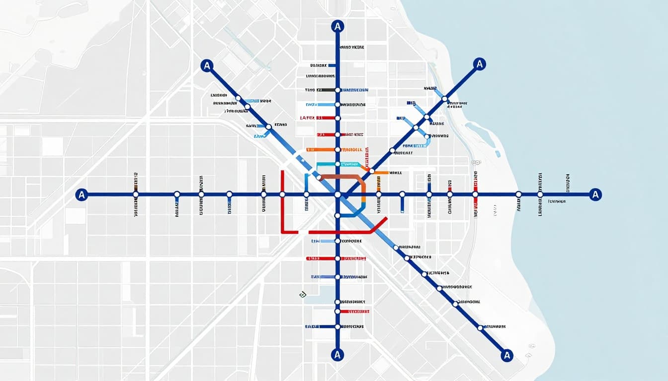
New York City subway maps: thick lines, many service types
New York’s system is huge, so the map needs to do extra work. MTA maps often use bold colored lines, clear station dots, and special symbols for service patterns.
If you want the official rider perspective, start with the MTA’s guide on subway basics, transfers, and using maps at stations. Their “How to ride the NYC subway” page also covers how to find maps and plan around service status.
In the NY style, line colors are your quickest clue. Numbers and letters identify services. Some lines operate in different ways, so the map may show local stops and express stops differently. That’s why step 6 (schedule details) matters on longer trips.
Also, New York updates its map design over time. Realtime info through 2026 notes changes that aim to improve readability, including a clearer layout for screens and accessibility-focused details.
London Tube maps: classic lines and transfer circles
London Tube maps use a familiar diagram style. Lines are often straight, colors stay consistent, and interchanges show up clearly. That style traces back to Harry Beck’s original concept, which TfL describes as a design classic because it emphasized connections.
If you want to view current Tube maps and formats, TfL hosts map pages where you can search for stations and download versions (including large print and step-free guides). Even if you don’t download anything, scanning the legend can teach you how to read the symbols.
On a Tube map, you’ll often see:
- Line colors with simple station dots
- Loop or branch shapes that show service connections
- Clear swap markers for interchanges
The best way to study London is to pick one line, then follow it from end to end. Notice how the map keeps the line smooth even when the real route bends underground.
Tokyo rail maps: station numbers and bilingual labels
Tokyo can feel intense at first, but its maps often help you faster than you expect.
Tokyo Metro provides subway maps in English and includes station number guidance. That station numbering approach uses a line letter plus a number, often shown with colored circles. As a result, even if station names feel unfamiliar, the system gives you another way to confirm stops.
For practical “how to use the subway” guidance, the official GO TOKYO site walks riders through using the system with a map. It’s especially useful for first-time visitors who want a calm, step-by-step mental model.
Also notice that Tokyo maps often use both English and local scripts. That doesn’t mean you must read every word. Your job is to use:
- Line colors
- Station numbers (when shown)
- Transfer station names (when you spot them)
Meanwhile, look for busy transfer points like major hubs. Those places often show multiple connections in a tight area, so interchanges become your main focus.
If you study these three cities, you’ll see one theme. Transit maps all teach the same skill: connections first, streets second.
Smart Tips for Beginners Plus Mistakes to Skip
Beginner-friendly reading is mostly about how you avoid false confidence. You think the map shows everything. Then you realize it’s showing connections in a different way.
Start with two habits:
First, check your start point every time. It’s easy to misread a dot if you glance quickly.
Next, compare the map with station signs when you’re at the platform. If the map says you’re on the right line, the sign should confirm it.
Now, let’s cover common mistakes that cause 90% of “I got lost” moments.
One frequent issue is assuming lines match the street grid. Transit lines may look straight, but the train may curve a lot. So don’t plan your walk based on map “distance.” Instead, use signs for street directions after you exit.
A second mistake is choosing the wrong direction. Even if you picked the right line color, the train might go toward the opposite terminal. Arrows and terminal labels help. Use them.
Third, watch out for express vs local service. Many maps use special markers for stations that are skipped. If you don’t check, you can ride past your stop without realizing.
Fourth, don’t ignore service changes. Weekend and late-night routes can differ. Many systems show this with alternate diagrams or notes.
Here’s a short list of mistakes to skip before you head out:
- Confusing similar colors (especially in dim station lighting)
- Missing an interchange because you focused on the destination first
- Forgetting to check weekend or late-night notes
- Picking a route that works “on paper,” but not at your time
Now, the good news: modern updates make transit map reading even easier.
By 2026, some systems push more information into maps and apps. For example, MTA app updates reported in March 2026 added real-time arrival info and an accessibility mode with a map of accessible stations. If you want the official details, see the MTA press release about the new app and its features. That kind of update helps when you can’t rely on one map alone.
You’ll also see more real-time map displays. Mass Transit Magazine reported a shift toward real-time 3D views for NYC subway info, which can reduce uncertainty when trains run late. For many riders, that means fewer guesswork moments.
So yes, the map still matters. But you now have backup tools if something changes.
Transit maps are meant to show connections. Your job is to follow those connections, not the street layout.
Conclusion
Transit maps are simple on purpose. They ignore real streets and focus on what you need most: where you can get on, where you switch, and where you get off.
When you know the symbols and colors, the map stops feeling like a test. Then the 6-step plan gives you a reliable way to read any route, even in a new city.
Use real examples as practice, because New York, London, and Tokyo all follow the same core idea. Add a quick look at station signs, and you’ll catch direction and express details before you board.
Next time you’re rushed, try the same routine. Then ask yourself one thing: are you following the connection route, or your guess about the streets?