Users decide in under 3 seconds if they’ll stay, and poor mobile navigation can spike bounce rates by 54%. If your menu feels crowded, your labels are vague, or tapping takes too many tries, people leave before they ever find what they need.
These are some of the most common navigation mistakes in website UX design, and they hit conversions fast because they add friction (and doubt). On top of that, Google ranks mobile versions first, so confusing navigation can hurt SEO too, even for desktop visitors.
In the sections ahead, you’ll see the five biggest issues dragging down your site (and what to do instead), starting with the most common one that causes users to feel lost.
Simplify Cluttered Menus Before They Cause Decision Paralysis
If your menu feels like a crowded hallway, users will hesitate before they move. That pause costs trust, time, and clicks, because people just want the next right step.

Spot the Clutter in Your Own Menu
Start with quick, honest checks. Don’t guess, measure. Then ask what a first-time visitor would do in the first 10 seconds.
Run these self-audit steps:
- Count menu items on the main navigation. If you have dozens, you already have a problem.
- Scan dropdown depth. Open each dropdown and check whether it spills off the screen on mobile, or forces awkward scrolling.
- Look for “off-screen expand” behavior. If a submenu pushes content down, hides the page title, or overlaps key sections, users lose their place.
- Watch heatmaps (or use session replays) for hesitation. If you see users pausing, tapping the same area, or bouncing right after scanning the menu, the menu is doing harm.
- Check label clarity. “Resources,” “Tools,” and “Company” often mean different things to different people.
Here’s the simple mental model to keep in mind: a menu is a map, not a storage closet. If the map holds too many streets, people stall at the corner.
A real-world pattern shows up often. For example, one coaching website buried contact info deep inside a long dropdown. As a result, users could not find it quickly, and the team saw a 40% drop in bounce rate after simplifying the menu and moving key actions higher. And this matters even more on mobile, where bounce rates are about 54% higher when navigation is hard to use.
If you want a solid baseline checklist for menu usability, use NN/g’s menu design guidelines.
Quick Wins to Clean Up Fast
You can make meaningful changes without a full redesign. First, decide what people come for most. Then shrink the menu until it feels like it has room to breathe.
Use this step-by-step plan:
- Prioritize the top tasks. List the top 5 to 7 actions users need, like Services, Pricing, How it works, and Contact.
- Remove redundants. If two items lead to the same page type, combine them. If one item is rarely used, consider moving it to the footer or a single “More” page.
- Group logically. Related items should sit together under one umbrella. Avoid deep chains like Menu → Submenu → Sub-submenu.
- Flatten dropdowns. Keep dropdowns short enough to fit on mobile without covering the whole screen.
- Test with 5 users. Watch whether they can find “contact” or “pricing” on the first try.
Card sorting helps you match how people think. When you run it, you often learn that your current labels do not match user mental models. For tool options and formats, see card sorting tools from Maze.
Do a before/after check that’s easy to understand: before, users bounce because the menu hides key actions. After, the menu shows fewer choices, so people move faster.
Clear Up Confusing Labels to Build Trust Instantly
Confusing navigation labels feel like a smudged sign at the grocery store. You can still shop, but you hesitate first, then you rush, and often you leave. When labels change from page to page or use vague words, people stop trusting that your site “gets it.” As a result, they move on fast.
That matters even more on mobile. Google research often cited shows 53% of mobile users leave when a page takes more than 3 seconds to load. Add label confusion on top of slow moments, and users abandon even sooner because they cannot predict what happens next. In short, labels are not decoration. They are promises.
Also, clear labels support SEO. They help search engines understand page topics and improve internal linking signals through descriptive anchor text, instead of generic terms like “Resources.” For practical UX writing tips, see a guide to better labels.

Common Label Traps to Dodge
Start by scanning for label traps that quietly break trust.
- Vague benefit words: “Solutions,” “Resources,” or “Tools” sound nice, but they tell users almost nothing. Replace them with nouns that match intent, like “Pricing” or “Case Studies.”
- Mismatch between label and destination: If your menu says “Support,” but users land on “Company News,” frustration spikes instantly.
- Inconsistent casing and style: “services” on one page, “Services” on another makes the site feel unstable. Even if it seems tiny, it reads as careless.
- Icon-only navigation: A hamburger icon or a lone circle icon without text forces extra guesswork, especially for new visitors.
- Same label, different meaning: “About” that means “Team” on one page and “Our Story” on another creates cognitive whiplash.
Try this quick test: open three key pages and compare the navigation. If the wording, grouping, or emphasis changes, users feel the ground shift under them. Fixing this also helps SEO because your site structure becomes easier to interpret through consistent link text and page topics.
One more thing, inconsistent jargon can also break internal search and indexing patterns. When you keep labels stable, you help both users and crawlers build a clear map of your content.
Make Labels Stick with These Habits
You can prevent label confusion with habits that keep navigation consistent and understandable.
First, lock in a label system. Use the same words across the site, and make each label map to one clear purpose. If you sell services, “Services” should not secretly turn into “What We Offer” somewhere else.
Then, test for understanding with quick user checks. Ask users to explain what a label means before they click. If they guess, your label is too vague. In addition, run small A/B tests to find which wording reduces hesitation. For example, test “Pricing” against “Packages,” or “Contact Sales” against “Get in Touch.”
Finally, keep nav behavior consistent across breakpoints. If the hamburger menu hides on desktop but shows on mobile, make sure the destination labels still match exactly. Highlight the active section too, because it reassures people they are still in the right place.
For more evidence-based guidance on navigation performance, read navigation best practices for better UX.
Unhide Key Pages So Users Find What They Need
When users land on your site, they should never feel like they entered a building with no room numbers. If key pages feel hidden, people blame you, not the navigation. Then they bounce, especially on mobile, where every extra tap feels like a dead end.
Signs Your Important Pages Are Lost
Start with the clues. If your contact and pricing pages are hard to find, you’ll see it in behavior and search visibility.
Look for these red flags:
- No clear path to contact or pricing: Users hunt for a “talk to us” link. They leave before they ever reach a form.
- Deep nesting: People must click 3 or 4 layers deep just to reach basic info. Big sites feel this pain the most.
- Missing sitemap or weak internal linking: Search engines and users struggle to map your content. Even good pages get ignored.
- Mobile mazes: Menus expand, sections shift, and the page loses its sense of place. Users then try again from the top.
- Bad “trust moments”: If a user cannot find proof, pricing, or support fast, they assume the site is risky.
Here’s the quick reality check. Open your site on mobile, then try to find contact and pricing without using search. If you hesitate, your users will too.

Also, watch for the “audit trap.” Teams often fix visuals first, yet the navigation stays confusing. For a grounded look at how information architecture affects business results, see the hidden cost of poor navigation.
Easy Additions for Better Wayfinding
Wayfinding works best when it’s layered. Add multiple paths to the same destination, so users can recover when they miss the first one.
First, make search a real tool, not a hidden icon. If audits show traffic drops, it often starts here. Add a visible search bar, especially on content hubs and ecommerce categories, and make results feel instant and relevant.
Next, add breadcrumbs on content and category pages. They show your location and let users step back cleanly. If you want a practical guide, use UX breadcrumbs patterns and best practices.
Finally, tighten your footer strategy. Your footer acts like a second chance. Include links to your top tasks, such as:
- Contact
- Pricing
- Services or Categories
- FAQs or Support
Bottom line: unhide key pages by giving users obvious routes, plus backups. When navigation stops feeling like a maze, clicks turn into confidence.
Fix Mobile Navigation to Capture 60% of Your Traffic
Mobile traffic is already the majority in the US. In February 2026, mobile made up 53.31% of all website traffic. That means your navigation on phones has to work like a well-lit trail, not a maze.
If you miss on mobile, you lose before users can even think. Tiny taps fail. Panels overlap. Animations lag. Then people bounce, and your traffic never reaches your key pages.

Mobile-Specific Nightmares Exposed
Start with the issues that only show up on thumbs. These failures feel small during design reviews, yet they break trust fast in real use.
1) Thumb-friendly fail checks (tiny targets, hard hits).
If your menu buttons are too small, users press the wrong item. Often, they blame the site, then leave. A simple fix is to build with thumb reach in mind, not desktop precision.
2) Overlap issues (tap blocked by what you can’t see).
Overlapping elements create a silent problem. The menu might look open, yet taps miss because something sits above it, like an invisible header or sticky banner. As a result, users feel the page “fights back.”
3) Slow slide-outs (feels broken, even when it loads).
When the panel takes too long to open, users think the tap did nothing. Meanwhile, they hit back. Then they return to the home screen. Smooth motion matters because it tells people the UI heard them.
For a practical look at hamburger patterns, compare your behavior to guidance like common hamburger menu mistakes and fixes. Also, review alternative mobile navigation patterns from UXPin’s menu pattern breakdown. You can keep your menu style, but you must match it to user expectations.
After you spot the nightmares, run one quick “phone-only” test. Open your site on a real device, not a simulator. Then try to reach contact, pricing, and the main category without backtracking.
Bottom line: mobile navigation errors don’t just slow clicks, they remove certainty.
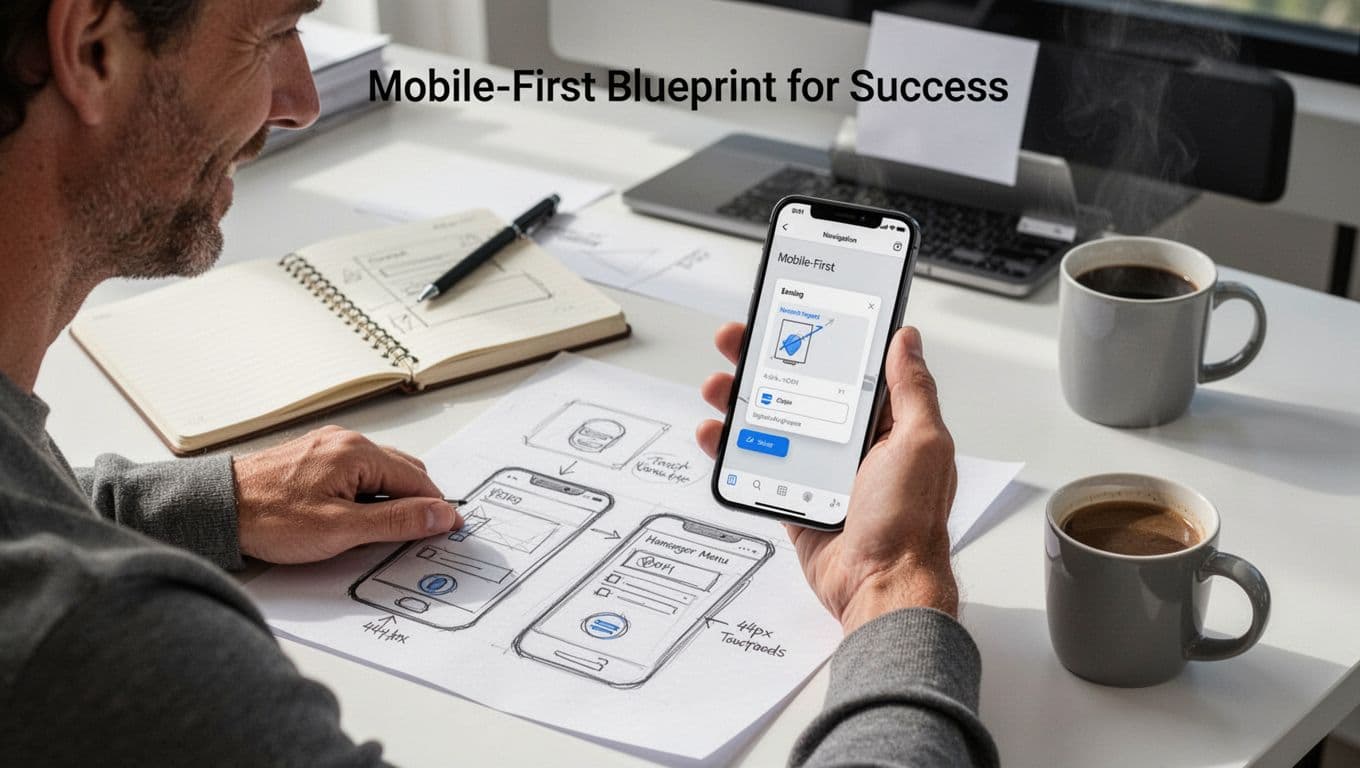
Mobile-First Blueprint for Success
Now build the fix the right way. Mobile-first design is not a shrink-and-hope step. Instead, it’s a phone-first process that controls layout, touch targets, and motion from the start.
First, sketch phone first. Draw the menu as it will appear on a small screen. Keep the structure simple, so every tap has a clear outcome. Then, confirm your targets with real numbers and habits.
Use these core rules while you design:
- 44px min taps for buttons and menu items, so people can hit correctly on the first try.
- Smooth animations for open and close states, so taps feel responsive.
- One clear path to each key page, so users do not hunt under pressure.
Next, test motion like you test form fields. A fast menu still has to move in a way users can follow. If the panel jumps, covers too much, or shifts the page unexpectedly, it creates friction. Also, prevent “page jump” by locking the background scroll when the menu opens.
Finally, verify your mobile navigation in the places that matter most. Check it in:
- Thumb zone reach (top of screen, middle, and bottom actions).
- Small screen widths (the narrowest iPhone and Android sizes).
- Real network conditions (slow 4G, not perfect Wi-Fi).
If you want a broader reference for mobile-first steps, see a mobile-first design step-by-step guide from Visual Soldiers. Use it as a checklist, then keep your own decisions tied to what users need: fast access to the next click.
Bottom line: when your menu feels predictable, mobile traffic converts more often.
Create Visual Hierarchy That Guides Users Effortlessly
When your navigation has clear hierarchy, users don’t “figure it out.” Instead, they read it. As a result, they move faster, feel safer, and leave fewer tabs open in the background.
Think about how people shop online. They scan a shelf, then grab one item that looks right. If every box looks identical, the scan turns into stress. Poor hierarchy works the same way in menus and page sections, especially during those first seconds when attention is split.

Nielsen Norman Group explains that visual hierarchy helps deliver attention to the most important elements through size, contrast, and grouping. Visual hierarchy in UX: definition. In navigation, that means users should spot the path quickly, even when they’re distracted.
Hierarchy Breakdowns to Avoid
Several common issues break visual hierarchy in a way that quietly raises cognitive load. First, users spend mental energy guessing. Then, they either click the wrong thing or bounce to a competitor.
Here are the biggest hierarchy breakdowns that cause exits, often within the first 10 to 20 seconds of scanning:
- Flat designs with equal-looking links: When every menu item has the same font size, weight, and color, users can’t tell what matters first. Equal options force comparisons that take time and raise error rates.
- Competing links with the same visual weight: For example, if your top nav includes “Services,” “Case Studies,” and “Blog,” but your primary call to action looks identical, the CTA stops being a CTA. It becomes just another guess.
- No focal points: Without contrast, your eyes bounce. Meanwhile, users feel like they are searching a crowded store aisle. In short, they hesitate because nothing “pulls” their attention.
- Same typography at every level: If headings, sub-navigation, and body labels all share similar sizes, the page reads like one wall of text. As a result, users lose the sense of structure.
- Weak grouping and spacing: When items sit too close together, they blur into one block. Therefore, users misread boundaries and often click twice to recover.
A quick test helps. Look at your navigation from 2 feet away (or squint on purpose). If you can’t identify the top action instantly, hierarchy is missing.
Also, watch for right alignment in navigation. Nielsen Norman Group notes that right-justified menus can make scanning harder because users tend to scan down the left side first. Right-justified navigation menus impede scannability.
Fixing hierarchy usually starts with ranking. Decide what should be noticed first, then make everything else respectfully fade.
Design Cues That Lead the Way
Once you know what breaks hierarchy, the next step is simple. Add design cues that guide the eye, reduce guessing, and clarify where to click next.
Start with a clear rule: promote the user’s next step. If you know the most common intent, you can design the nav to match it.
Use these cues to steer attention:
- Bold primary links (and only a few)
Make your main navigation choices stand out with stronger weight or slightly larger size. Keep the rest lighter, so users still get options without turning the menu into a poll. - Whitespace as a wayfinding tool
Spacing does more than make things “look nice.” It creates borders in the mind. When items have air between them, users understand grouping faster. - Progressive disclosure for deeper choices
Don’t show every option at once. Instead, reveal detail when users need it. For example, show “Services” in the main nav, then open a dropdown for categories like “Design” and “Development.” - Consistent styling for the same meaning
If a link style means “current section,” keep it that way across pages. Consistency reduces mental work, because users stop re-learning your site. - A clear CTA path
If you have a key action like “Request a quote,” give it a distinct visual cue. Color contrast and button styling work well, as long as you don’t overuse them.
To sanity-check your menu structure, use a practical baseline like the NN/g menu design checklist. It helps you verify visibility, option clarity, and control.
Here’s a concrete example. If your header has 7 links, pick 3 as “primary” and style them stronger. Then keep the rest lighter and grouped under one logical parent. Users get a clear route, and the page stops feeling like a test they didn’t study for.
2026 Navigation Trends to Stay Ahead of the Curve
Navigation trends in 2026 aren’t about adding flash. They focus on reducing doubt, cutting taps, and helping people move with confidence. Think of your site like a good host. It notices where guests hesitate, then offers the next right step.
To stay ahead, you need to watch what’s changing, then test it in your own UX. Here are the most practical navigation trends showing up in modern designs.

Hidden and Experimental Menus, Used with Restraint
More sites now hide navigation until it earns attention. The idea is simple: fewer items on screen, less visual noise, and a cleaner page during first glance.
However, “hidden” can backfire fast. If users do not see a way to explore, they feel stuck. So, when you use hidden or hover-based patterns, you still need obvious fallbacks (like a visible search icon, a sticky back link, or a clear menu affordance). In other words, don’t remove the map, just reveal it when people want it.
A good rule: if you remove something, replace it with a clear next move.
AI and Contextual Paths That Still Feel Predictable
AI-driven navigation is growing, and it usually shows up as contextual suggestions. For example, the menu may emphasize “Pricing” for a visitor who lands on a product page. Or it may surface “Emergency contact” based on device and timing.
But users will trust you only if the behavior stays explainable. If your menu changes, make the reason obvious through consistency in labels, placement, and interaction rules. Also, keep the core navigation stable. AI should guide, not rewrite the site’s logic mid-click.
For teams building stronger wayfinding, it helps to review accessible, practical navigation guidance like Accessible Navigation for Complex Websites: A 2026 UX Guide.
Invisible and Adaptive UI, Plus Better “Recovery” Options
Adaptive navigation in 2026 also means subtle motion and UI that fades until needed. It reduces clutter, yet it should never hide important tasks from screen readers or keyboard users.
So build for recovery. When users miss a target, they should be able to reset in one action. That means strong internal links, clear section headings, and backup routes like search and breadcrumbs. Even better, test “miss paths” on purpose, such as what happens after someone taps the wrong category.
If you want a dependable baseline for where navigation patterns fit, use UX navigation design: Common patterns and best practices as a reference point, then adjust for your audience.
As you apply these trends, the next step is turning ideas into tests that prove they reduce mistakes instead of creating new ones.
Conclusion
If your intro hook promised faster choices, the fix comes down to one thing: reduce guesswork in your navigation. When menus are cluttered, labels are unclear, key pages stay hidden, mobile targets feel small, and hierarchy looks flat, visitors lose confidence fast.
Use these five quick wins to correct the biggest mistakes and calm the bounce trend. First, trim your main menu to your top tasks, then flatten dropdowns so they fit on mobile. Next, replace vague labels with intent-based names (like Pricing, Contact, Support). After that, surface contact and pricing through primary links, search, and breadcrumbs. Then, test mobile thumb taps for 44px targets and remove overlap blockers. Finally, build a clear visual rank so users spot the main action instantly.
For what to do next, run a fresh check on your live pages today, and then share what you find in the comments. What one nav change would most reduce confusion on your site in 2026, and why?
Better navigation means lower bounces, stronger trust, and more conversions.